How I Built Clocks
Try itI started with one clock in IST. It became a world-clock canvas through small changes to the face, fewer controls, and a lot of work on how things move.
What I created
Sources I used
| Source | Used for |
|---|---|
| Google Sans Flex | Rounded clock and city typography |
| Iconoir | Search, plus and minus icons |
| Framer Motion | Shared layout, springs and gesture feedback |
| flag-icons | Early country flags, later removed |
01One clock, in IST
I started with a white clock on a quiet gray background. The first result worked, but it came with a header and extra labels. I removed them so the experiment could stand on its own.
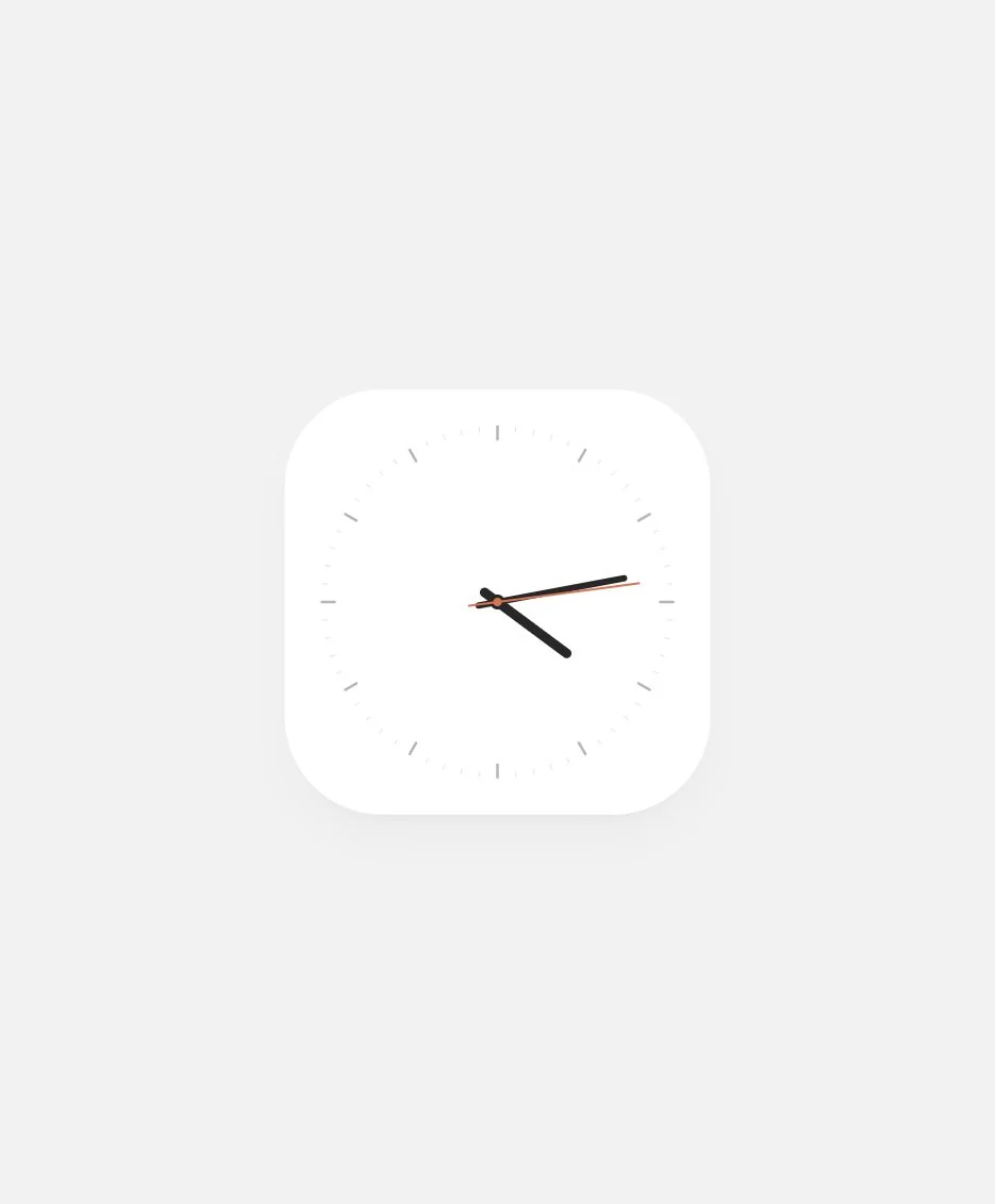
The first prompt
Create a new experiment called Clock. Create a minimal clock on #F2F2F2 background, make the clock white with a smooth corner radius, add 3 hands, start with IST.
Make it independent
Remove the extra interface
Make this a rule: no experiment should have a titlebar or extra details. Each experiment is independent.
02Finding the face
I tried a circular dial inside a gray case, then a more physical treatment with gradients, offset shadows and a shaded flag. After that, I made the dial square and let the ticks follow it. These were useful directions to try before simplifying.
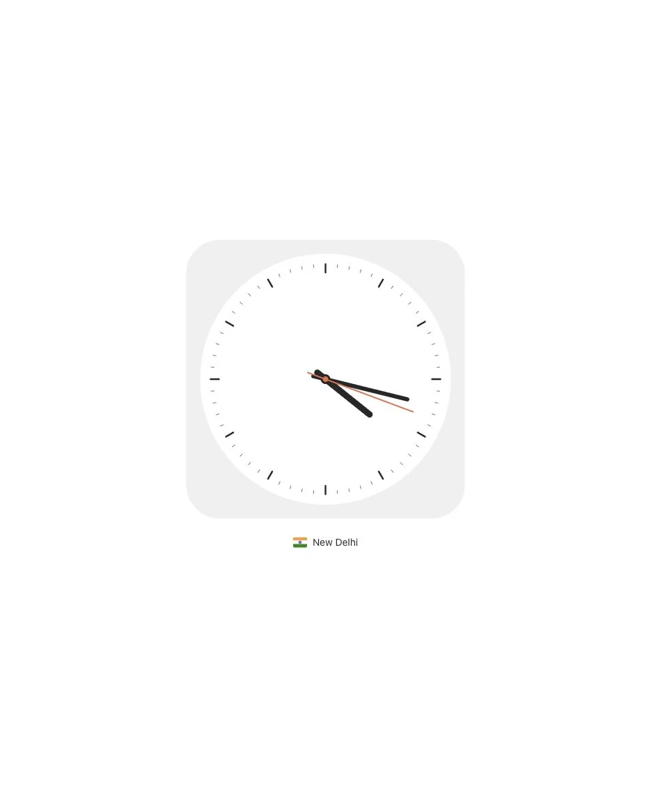
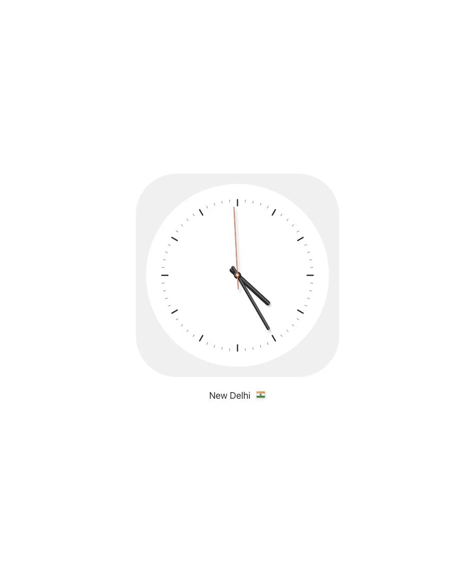
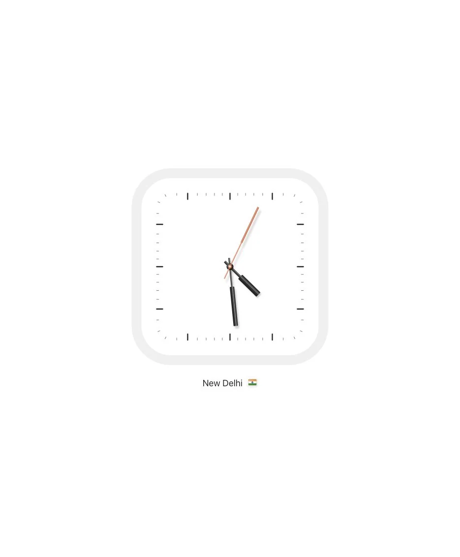
Separate the case and dial
Reduce the border radius, make the background white, make the clock base #F0F0F0 and the dial circular and white. The ticks representing multiples of five should be #272727 and the rest #727272. Below the clock, use the system default font and Inter as fallback at 14px. Write the city name, and use an open-source flags package to denote the country.
Corners, material and shape
Two small corner changes
Increase the corner radius by 10%. Increase by 10%.
Give the hands depth
Set border radius to 20%, increase space between rim and ticks by 16px. The center pivot should have a white dot on top. Make the needles look realistic with gradients, and each needle has an offset shadow so that it mimics a real-life environment. Increase the font of New Delhi to 18 and move the flag to the right.
Try a square dial
Make the dial square too, and minute ticks should follow the same shape. The clock hands should be a bit thicker. Use a shape like "==[[[[[[]]]]]]": thin at the start and fat at the end. Use rectangular blocks with a small corner radius.
03Simplify the silhouette
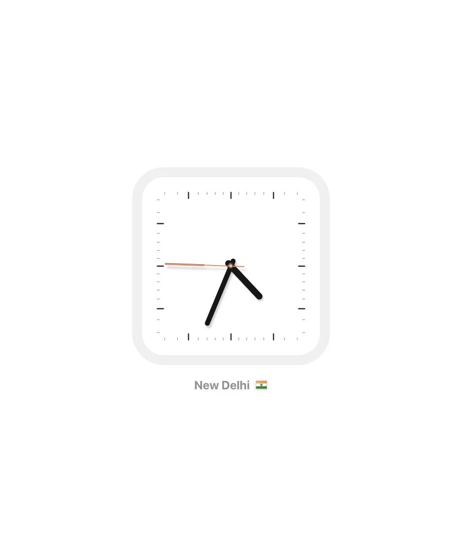
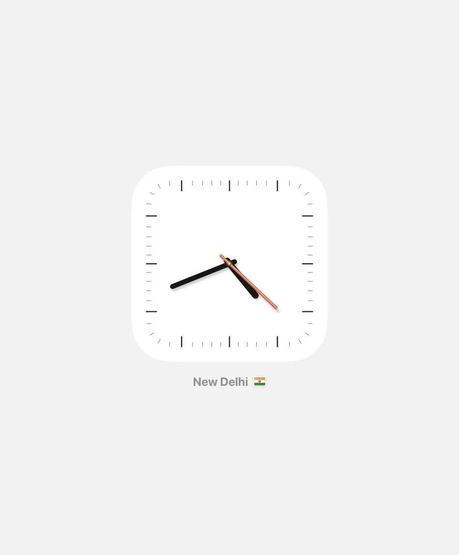
The block hands were too fussy. I moved toward thick rounded batons, applied the same treatment to the seconds hand, and returned to one white base on #F2F2F2. The continuous-corner shape became a custom SVG curve inspired by iOS, rather than a native iOS surface.
Round the hands
Make the entire watch more rounded by increasing border radius to 64. The hands are not good. Use thick black rounded baton hour and minute hands. Change the hands for the second hand too.
Return to one base
Reduce the layers
Add a background #F2F2F2, keep only one base #FFFF, make ticks longer and set the clock corner radius to 80px. Make sure it has iOS-style continuous corner smoothing. Make the seconds hand thick.
04From one place to a world canvas
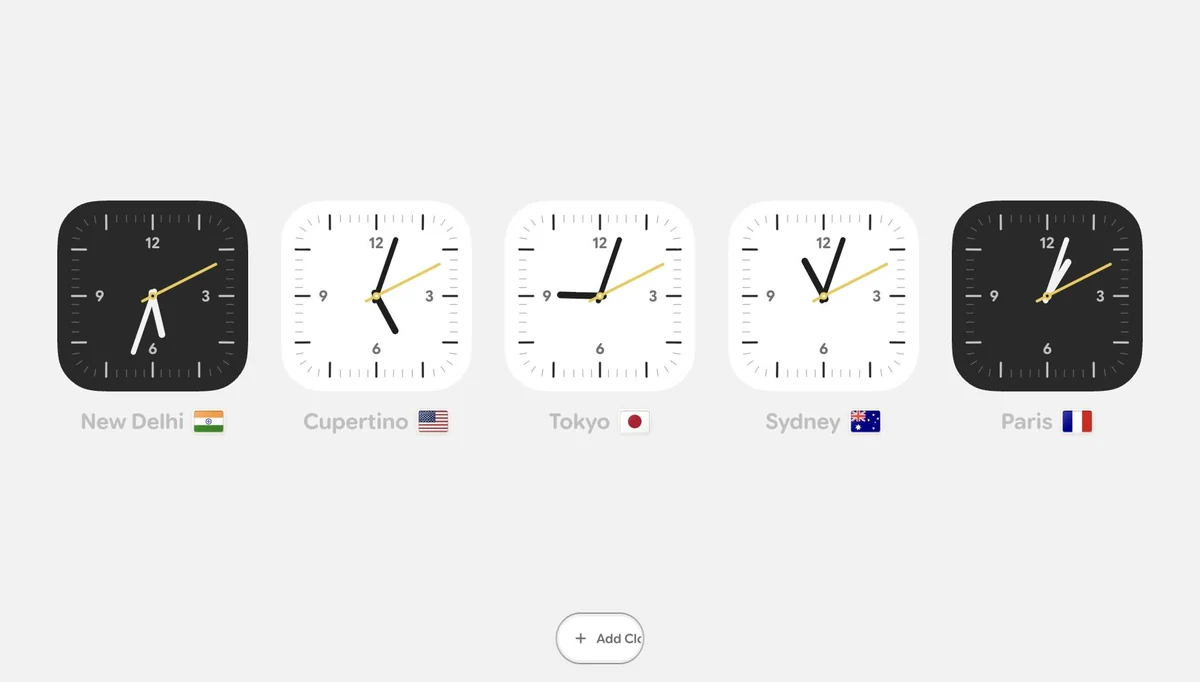
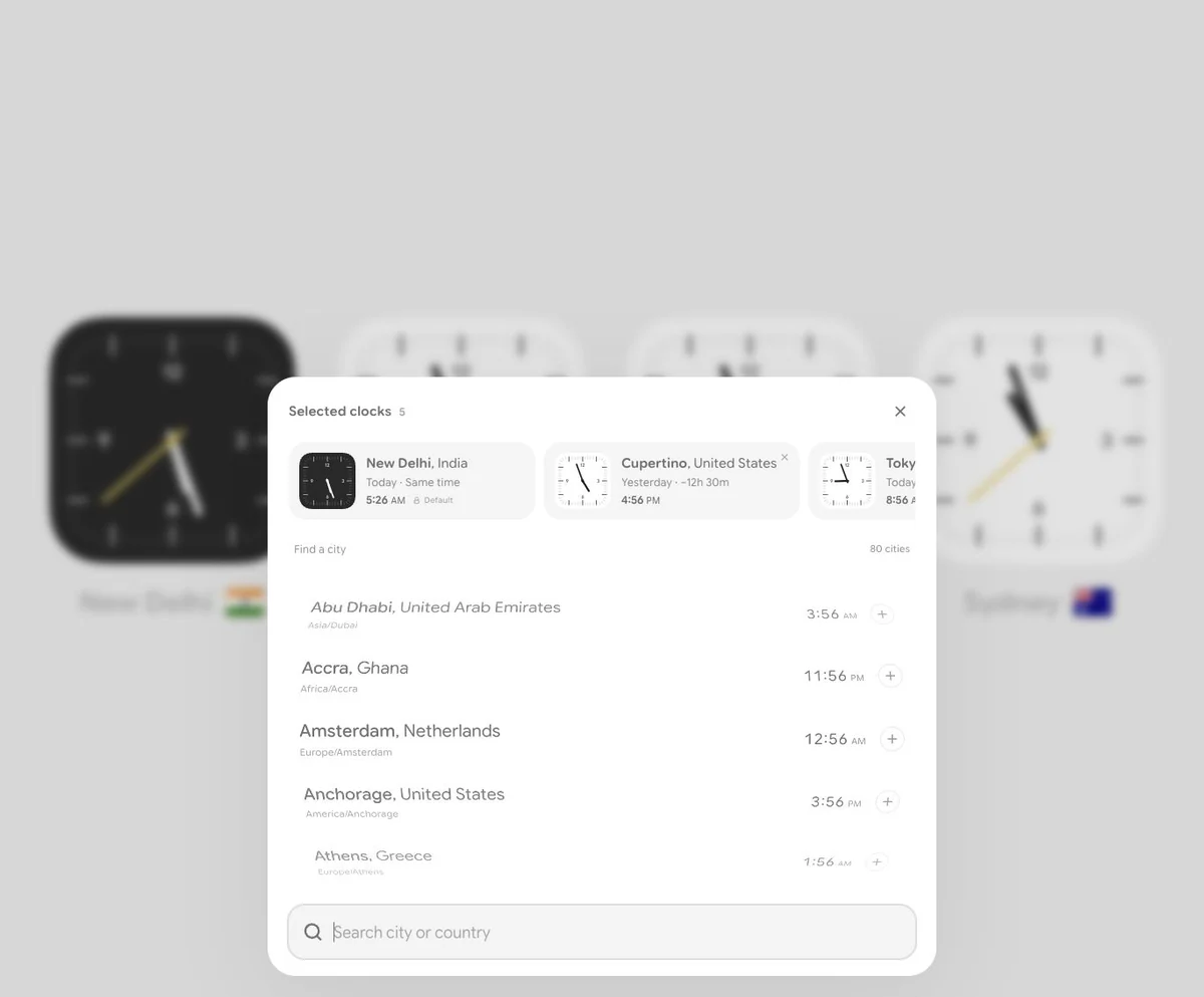
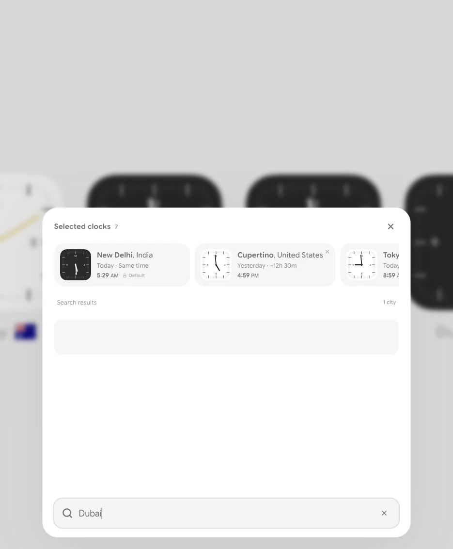
I expanded the idea into five clocks: New Delhi, Cupertino, Tokyo, Sydney and Paris. Night locations got dark faces. I added cardinal numerals, a yellow seconds hand and rounded Google Sans Flex labels. The first picker had selected-clock cards, miniature clocks and time differences above the city list, with New Delhi initially pinned as the default. Getting taps to work on transformed rows took another pass: the hit area stayed flat while the visual content moved.
Add more clocks
Add a plus button at the bottom. Once tapped, morph the same button into a drawer using Framer Motion, showing a search at the bottom. Focus search when it opens. Each selected clock appears in a small card showing the clock, with no seconds hand, on the left; then City, Country above the time difference. Also show Today, Yesterday or Tomorrow according to the current system clock. Make five clocks show by default: Cupertino, Tokyo, Sydney, Paris. Use a dark-themed clock where it is night.
The new face
Typography, ticks and yellow seconds
Use Google Sans Flex Rounded. Make the five-minute ticks longer, increase the width of all other ticks and use lighter gray. Make all ticks capsule shapes. Increase the length of the second hand and have a circle at the pivot. Write numerals for 12, 3, 6 and 9, and make the clock hand yellow.
05Remove what I did not need
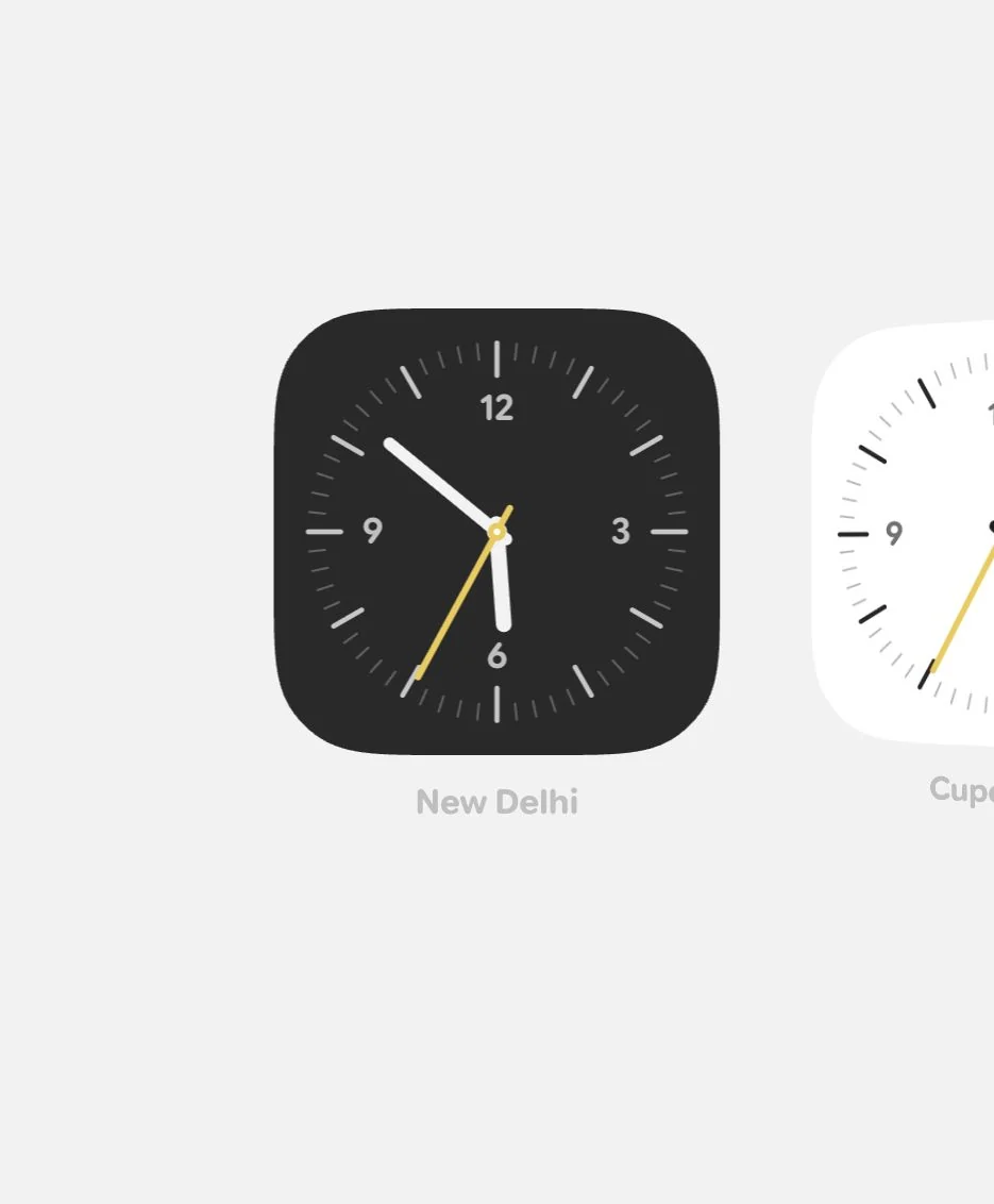
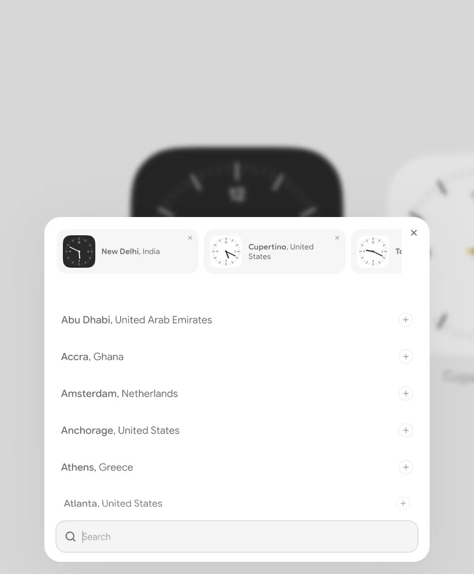
The next pass removed the flags and much of the picker copy. I made the clocks 1.5× larger, put circular dials inside the squircle bases, and kept the trigger as a plain plus. Every clock became removable. A nonempty selection persists; an empty saved selection restores the five defaults on refresh.
Make the canvas quieter
Remove flags completely, make the clocks circular, increase the clock size by 1.5× and increase corner radius by 5% with more continuous corner smoothing to create a squircle base. On page refresh, bring back the default clocks if all clocks are removed. Remove copy like Selected clocks and Search results. From list items remove all details other than City, Country. Just show a plus button; do not reveal hover text. On click, morph the same circle into the drawer.
06Make the depth feel right
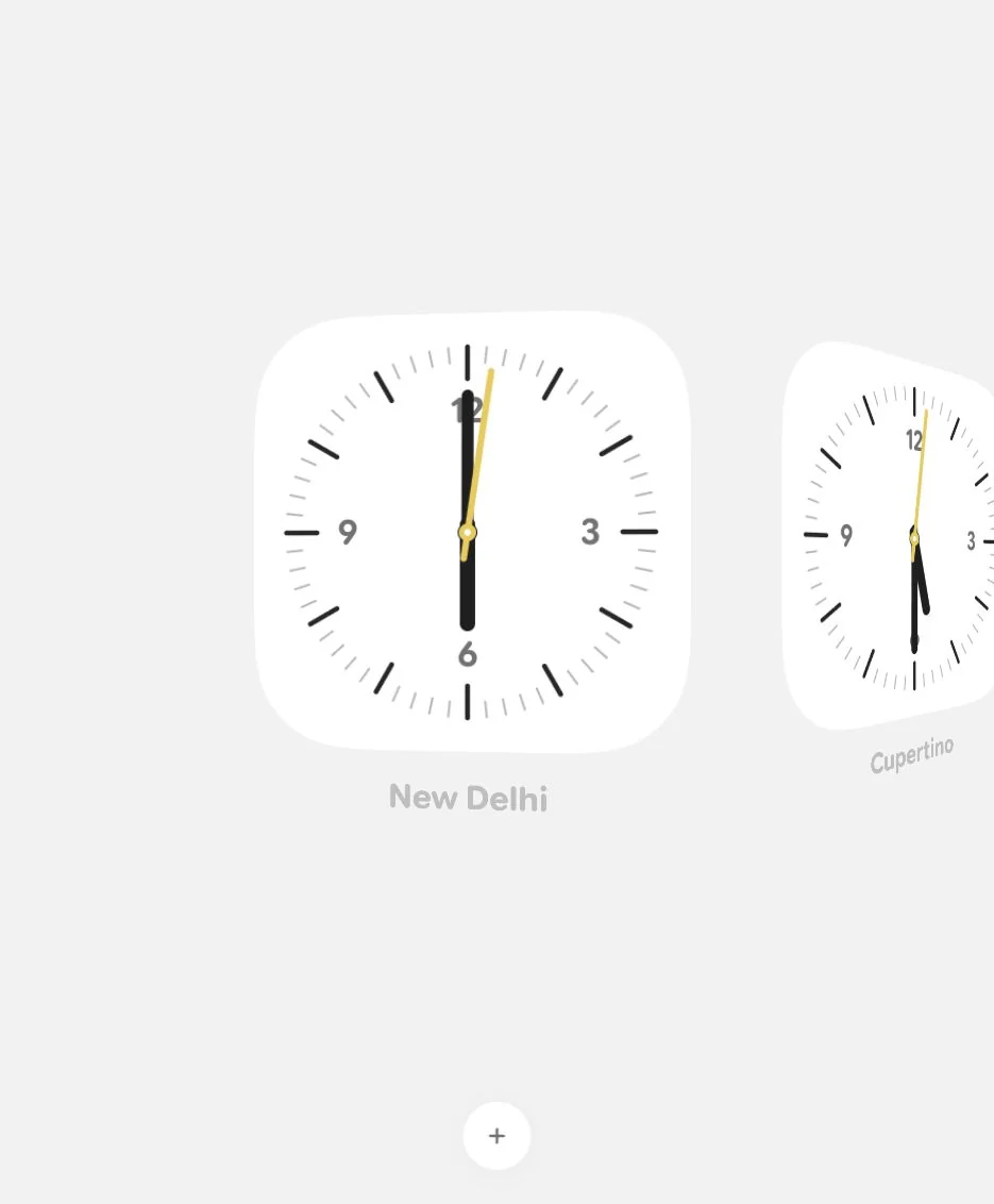
The first roll turned the clocks the wrong way. I reversed it into a stronger Cover Flow shape, then flattened the outer clocks again. Spacing needed to be judged between the visible faces, not just between their untransformed boxes. Full-page screenshots were also moving the scroll position, so I switched to viewport-only captures before trusting the motion checks.
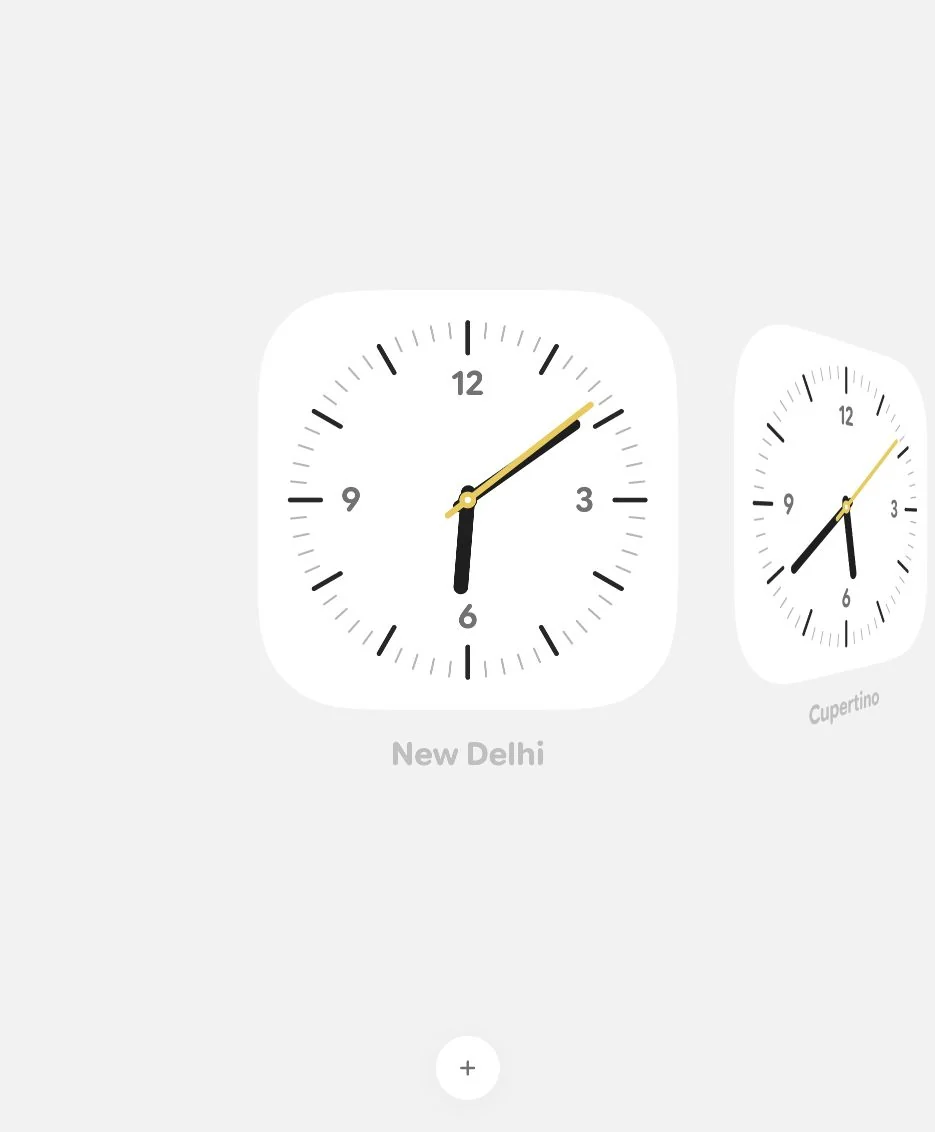
Reverse the roll
The 3D roll is wrong. Reverse the rotation on the sides and make it more like Cover Flow. The third clock on both left and right should look flatter, and the spacing is optically off.
07Hands and labels that hold focus
I returned to the hands with a paddle shape: narrower near the pivot, with a consistent-width blade and fully rounded corners. I increased the gaps by 10%, enlarged the center clock slightly, and softened the edge scale from 0.6 to 0.8. Larger city labels and quieter captions made the focused clock easier to read.
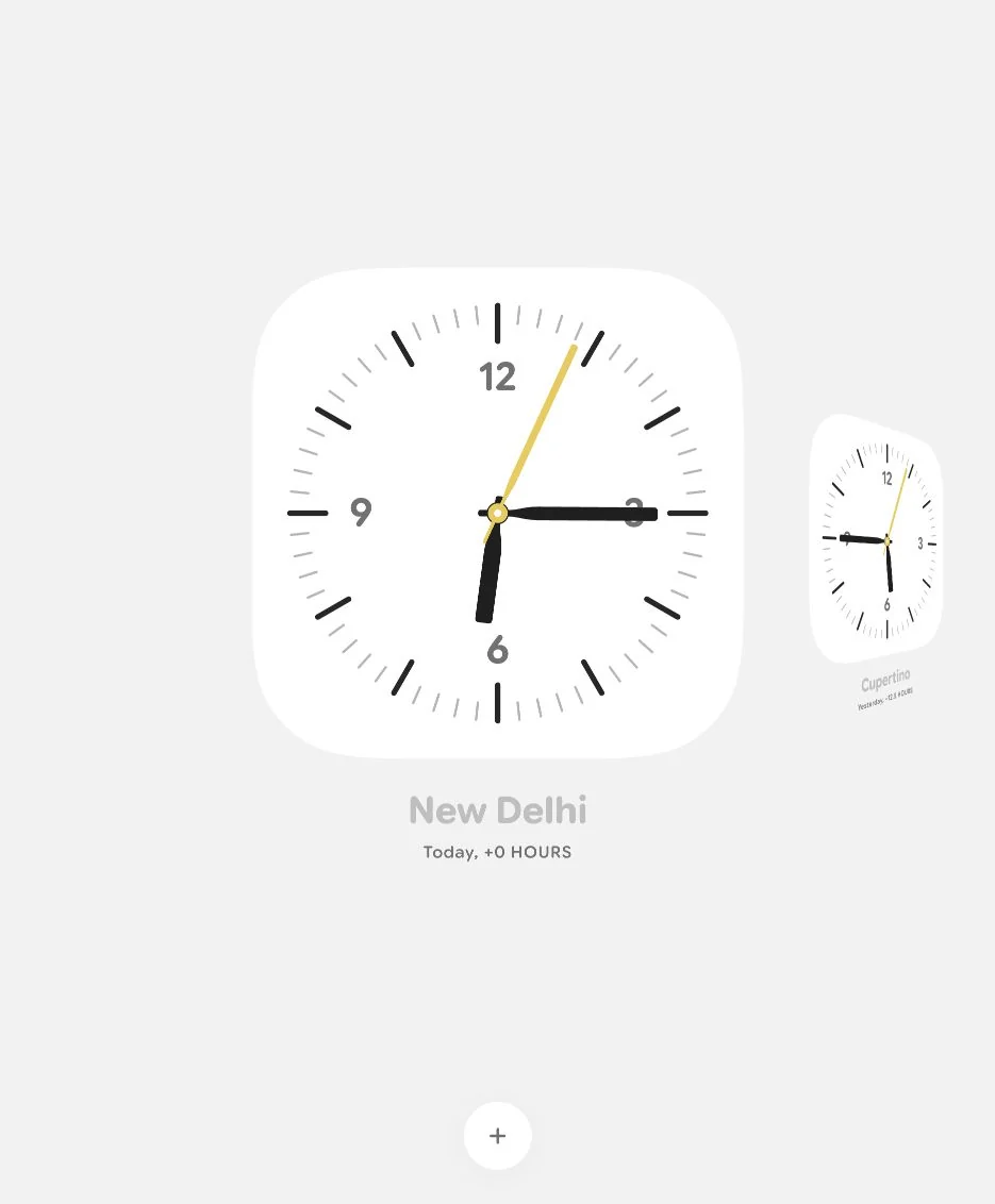
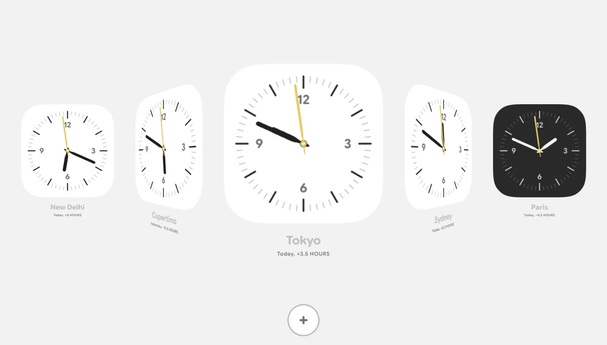
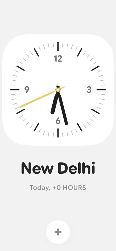
Shape the hands
The clock hands should be like ceiling-fan blades. Make sure the width stays the same; only reduce the part near the center to create a paddle shape. Make the corners of the clock hands fully rounded. The scale of clocks is too much: use 0.8 at the edges instead of 0.6.
Type and timekeeping
Give the details hierarchy
Set the city color for main clocks to #272727 and font size to 48px. Change the caption hours color to #909090 and increase font size to 20px, with margin-top 16px. Increase spacing between the clock and its details.
Check the synchronized seconds
All the second hands are moving at the same time in all clocks. Is that a convention or a logical flaw? Check and fix if needed.
The seconds stayed synchronized. These time zones change the hour and minute, not the current second. Relative-day labels and fractional-hour differences are calculated against the device’s timezone, including daylight-saving changes.
08A quieter picker
I removed the selected-clock strip, close button and row-level plus icons. Each city became its own toggle: selected cities stay in the list, turn green and can be tapped again to remove. A moving shared hover capsule felt confusing, and row scaling was another distraction. I removed them in favor of a local fade. The blur also needed care: padding belongs inside the moving content, while the edge effect reaches the panel boundary.
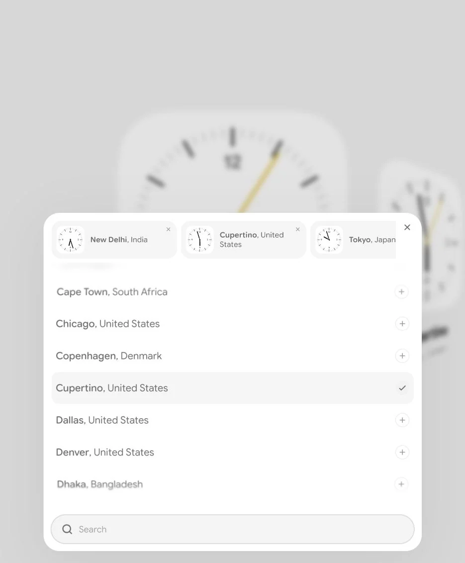
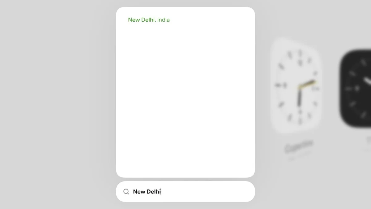
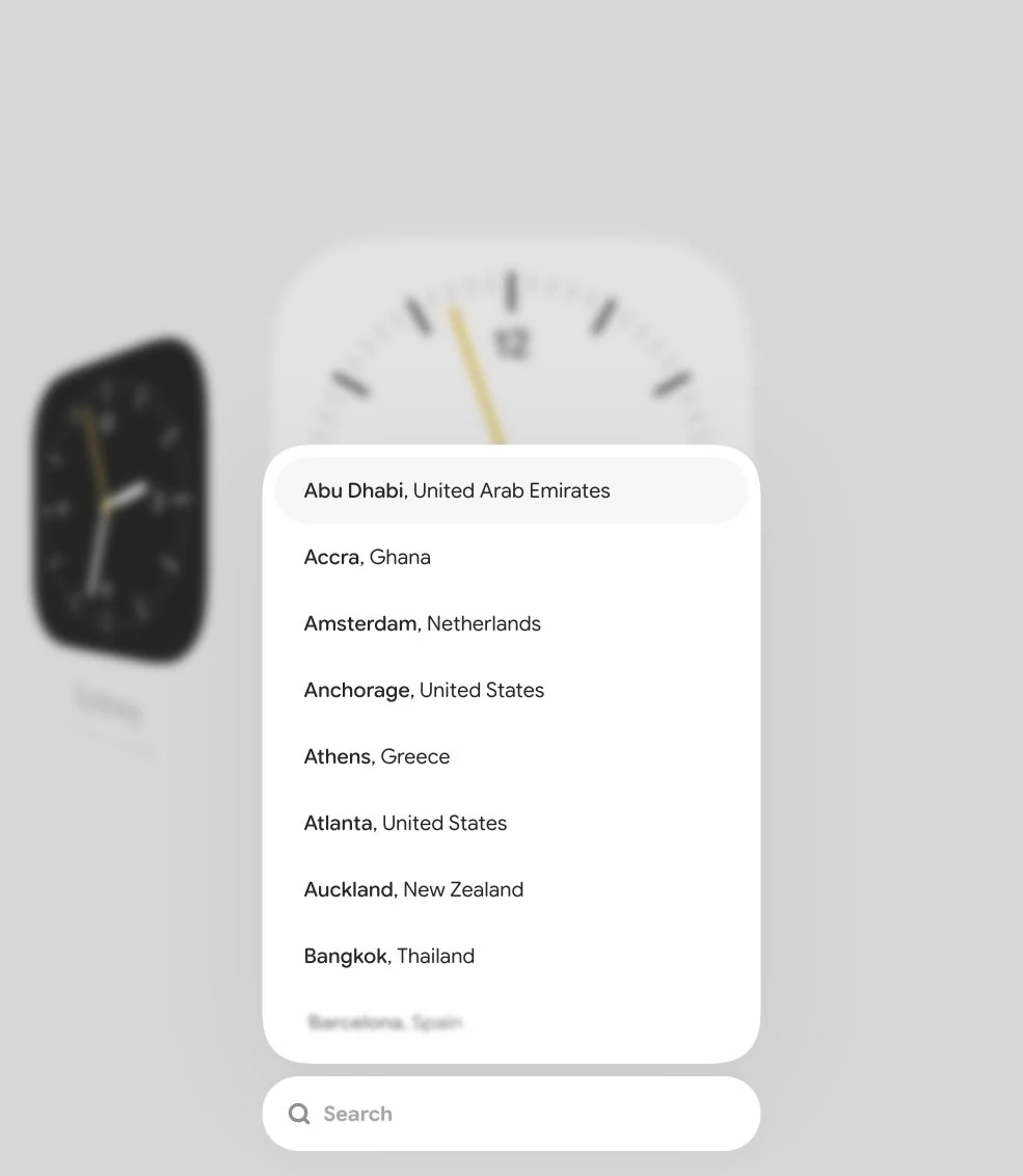
Keep only the useful controls
Remove the selected clocks from the plus-button panel. Make search pill-shaped and fully rounded. Remove the cross button and the plus buttons from each city row. Remove the white background below Search.
Selection and edge treatment
Use color as the selected state
The clocks that are added should still appear in the search list. Do not remove them. Remove the disabled effect from all list items. The clock that is added should become green #29A329, and tapping again removes it. On hover show a background bar, but remove the shared layout animation as it looks confusing.
Pad the rows, not the blur
Include inner padding from all sides, but make sure the edge blur stays on top and has zero spacing from the edges.
09Scrolling needed more than a snap
The first snap felt like a magnetic pull. A quick flick could still move only one clock, and continued input at the edge could delay the return. I wanted the motion to carry the gesture’s energy, settle into a clock, and give a small bounded stretch when there was nowhere left to go.
Respect the gesture
Scroll should work in both vertical and horizontal directions. While scrolling, add an Apple-inspired rubber-band effect for both scroll and drag. Consider velocity while dragging. The clocks should snap if scrolling ends at an uneven position.
Momentum and the end of the row
Avoid a delayed edge return
After the last clock reaches the center, do not let further scrolling count and add up to the rubber-band effect. Just add about 100px to cue that no more scrolling is available. The moment the user releases, the clocks should revert to idle rather than waiting for as long as the user kept scrolling.
Let a flick travel
When a user quickly presses, drags with intensity and releases, the clocks just move one position. It should work like iOS ScrollView: motion proportional to the flick, respecting momentum and velocity.
Pointer flicks gained a deceleration phase before alignment. Wheel input kept its own handling, because it can already contain momentum from the operating system. New input can interrupt the motion immediately. I also faded the labels toward the edges so they compete less with the clock in focus.
10Make removal feel attached
On the canvas, only the centered clock should be removable. I tried a shrinking barrel turn, reversed it, reduced the angle, then removed rotation altogether. Short pulls needed to come back; an intentional upward flick needed to complete without suddenly disappearing. The minus control also had to stay attached above the clock, with a clear gap.
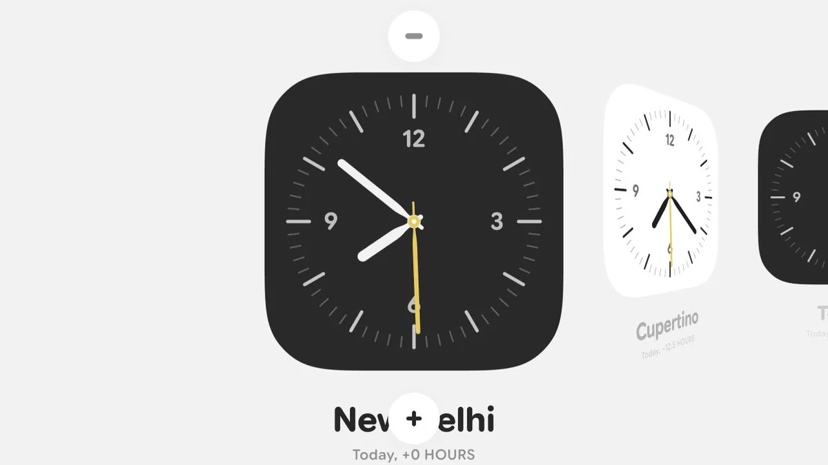
Remove the rotation
While dragging the clock to the top, remove rotation and scale. Just use blur and opacity, and reduce the required drag distance. Opacity should go down to zero. The moment it becomes zero, remove the clock.
Keep a fast flick readable
Bring back a controlled shrink
The flick-to-remove gesture results in sudden removal. We should scale down to about 0.65.
Keep the control attached
The remove button should appear at the top of the clock and not overlap it. Use the same effect when the minus is tapped. The minus should animate out as if attached to the clock.
11The last clock is a state too
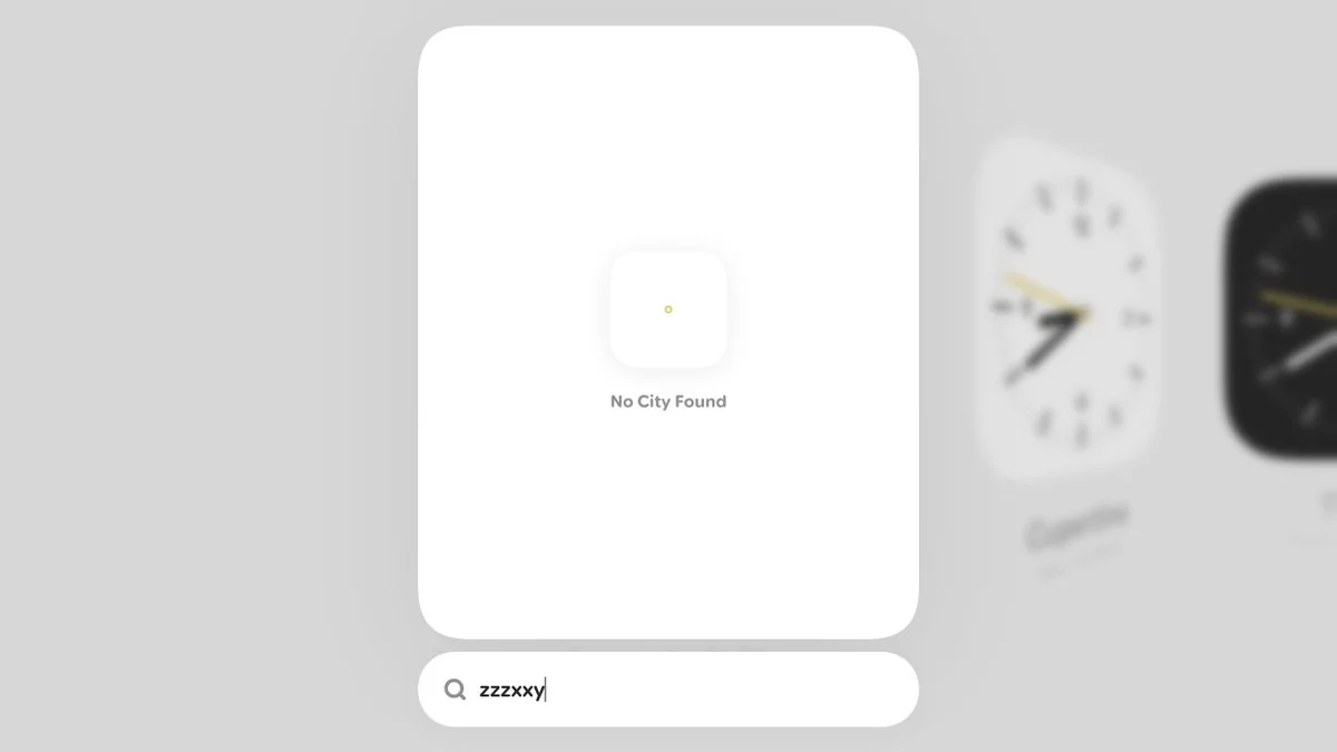
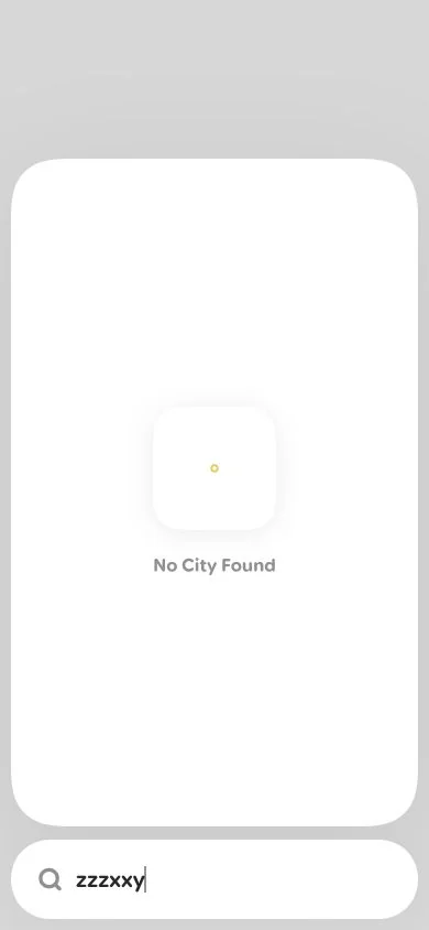
I extended the final departure and reduced its scale to 0.4. Removing the last clock now opens focused search automatically. A search with no result gets a handless white clock and a small yellow pivot ring. An empty canvas and an empty search are different states, so both needed an intentional response. Keyboard flows and phone-sized layouts were checked alongside the pointer interactions.
Handle the empty states
While removing a clock, increase the maximum translateY and reduce the scale to 0.4. When all clocks are removed, automatically open search. When no city is found, show a white clock with no hands and a small stroked yellow circle for the pivot. Below it, write No City Found in a 16px bold rounded font, using #909090.
12First, a film of the scroll
The first recording was a square scroll loop. I changed it to 4:3, mixed white and black faces, removed the cursor and plus, and pushed the pace. For these films I fixed the showcase time and choreographed scrolling so the composition could loop. The earlier interaction clips were captures of the running app; the app itself still follows device time.
Capture the motion
Record a perfect looping video of clocks at 1080×1080 and 60fps. Add more clocks for the recording. Show scrolling left to right and back again. Start with a white clock in the center and clocks on both sides.
Change the framing and energy
Make it snappier
Make the scroll fast to show the 3D bulge effect. Bring it under nine seconds and use 4:3. Remove the cursor and plus button. Center the full clock view vertically.
Use constant travel
Make the clocks a mix of white and black, with a white center. Scroll speed should be linear. At the end, reverse instantly without waiting. Make the video 1.25× faster.
13Back to the real edges
I renamed the experiment Clocks. After making the first films, I went back to the actual canvas: small wheel packets could still swallow the visible edge stretch. The fix lets a short burst move the whole track, keeps the end clock flat, and returns promptly without building up hidden scroll input.
Fix the app, not the recording
Make this change in the codebase; we are done with screen recording. When clock scrolling reaches an edge, the rubber-band effect is missing. It should behave like Safari page scrolling at the edges.
14Choreograph the interactions
I wanted a short film that revealed the whole experience: one clock, a sweep, the plus morph, picking a city, and both removal gestures. I added a grabbing cursor to make dragging clear. In the film, constant camera moves competed with the interface. Slowing the filmed morph also exposed a gap where the white surface disappeared before the contents appeared.
Show the interaction sequence
Show one clock in the center, then zoom out with a snappy transition and show horizontal scrolling. Show the plus click and expansion. Pick a city and zoom out to show it added at the back. Remove one clock by dragging it up, show the barrel effect, then use the top button to remove another clock. Keep the video 4:3, 60fps and a perfect loop.
Let the panel stay still
Stop the camera fighting the panel
Around three to five seconds, just put the search and panel in the center of the screen. No further zoom is required. The final clock removal should happen somewhere in the middle, not at the end of the row.
15Remove the last distractions
I kept the panel centered at 80% of the frame height and picked a city by scrolling, without typing. Fewer recording clocks limited the added-clock glide to two positions. After trying a slower filmed transition, I returned to the app’s own spring and fade timing. The last change was simply keeping the cursor over the selected city and letting it fade out.
Let the cursor disappear
When a city is selected, the cursor goes to the left. It should just fade out later, not move.
The final framing and timing
A larger, simpler picker shot
At three seconds, make search and the panel larger, covering about 80% of the height. Do not type anything in search; just scroll and pick a value.
Keep the motion readable
Make the panel animation natural and smooth; take more time if needed. After a clock is added, adjust the fast horizontal scroll caused by too many clocks. Make the cursor four times larger, and cut a few parts to keep the animations under fifteen seconds.
Return to the code’s timing
Now the list animation is very slow. Make it a little faster, like the timings in my code.
Takeaway
I brought the idea and the design direction: a quiet clock, deliberate contrast, minimal controls, and motion that felt physical. The details I kept questioning—corners, paddle width, optical spacing, the gap above a minus button—gave the experiment its character.
The most valuable skill was judgment. A working scroll was not enough if it felt magnetic. A smooth morph was not enough if the camera made it look jittery. Spotting those differences, and describing the next change clearly, gave each iteration a purpose.
AI was faster at producing and checking variants. Codex handled the implementation, timezone calculations, regression checks, recordings and exports. I kept choosing what should stay, what should go, and what still needed another pass.